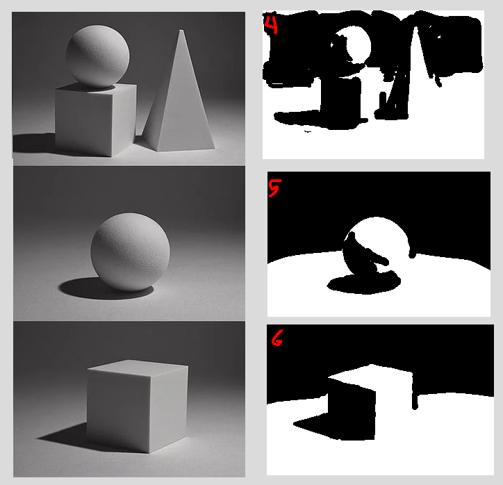
i began practicing these black & white exercises. I think the intention is to help you get better at seeing values & shapes, and breaking them down...
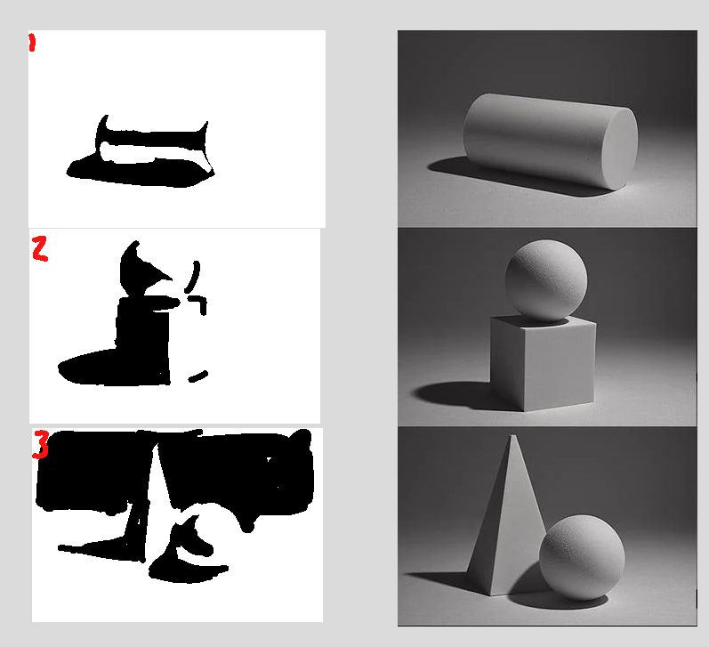
started off a little rough, especially without including the background shades.
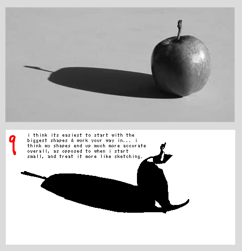
i felt like I should have practiced more with basic shapes, but I was struggling to find more reference images, and also was frankly a little bit bored. I tried an apple.
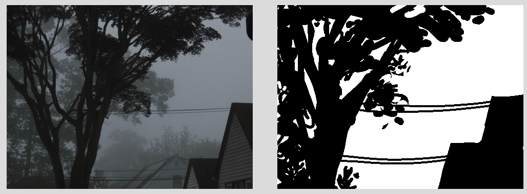
it was late, so I went to bed... Next day I tried again with a new image.
right now, I'm not sure how i feel. I suspect I'll just need to practice some more. i think this is useful, and helping, but I just haven't done a lot of it at all yet. I need to do more. Trying to decide what shapes & values are most important to bring out is, if nothing else, interesting.
I think you kind of have to look at every part of the image, and make a choice about every value that you see, rather than looking and trying to separate the shapes like... mentally... It's kind of hard to explain... You have to be actively decision making for each part, and I don't think I'm good at getting over the instinct to just do what my Brain tells me to, instead of my eyes.
. . .
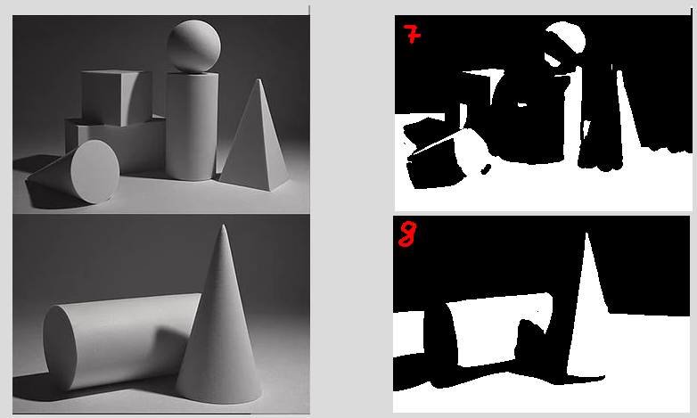
5/31/2025, started trying again. Started with an image i found off of tumblr, that did not have super clear contrast, to see how i could do.
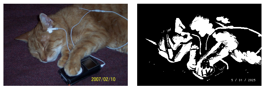
it was tough, at first I tried to interpret the values on whether or not they were closer to black or white, and the cat ended up unreadable. In order to make it readable, I had to push some values, not based on whether or not they would be posterized to black or white, but based on how to make them most readable to the colors surrounding... I'm not just trying to fight the lightest & darkest values, I'm trying to interpret them into a readable image right now....
For quick point of reference, here is the image if it's merely posterized :
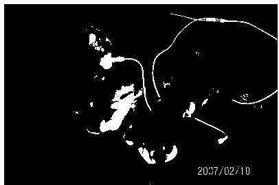
I don't think I need to explain why this doesn't work. You can use your eyes. (.... It's too dark and the shapes & forms are lost. The pixels are brought to the value they are closer to, of black or white, but it's not effective for making a readable image. I'm not trying to guess whether something is closer to black or white; I'm trying to make a decision about each value to make it read...)
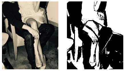
Despise this one. Looks terrible to me. Picked the photo because I thought it would be easier to do something higher contrast. I was wrong this one sucks. Was really frustrating to push around instead of satisfying, ended up giving up on this image. moving on.